Are Restaurant Menus Confusing on Purpose? Here’s the Truth
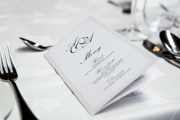
You sit down, hungry and ready to order, but the menu feels more like a mood board than a list of dishes. There are no descriptions, just poetic dish names, vague ingredients, and a sleek design that looks great… but tells you nothing. Sound familiar?
In recent years, many restaurants have embraced minimalist, abstract menus as part of a curated brand aesthetic. And while they may look stylish and upscale, these menus often sacrifice clarity, leaving diners confused, hesitant, and even frustrated. Worse, it can put unnecessary strain on restaurant staff who end up answering questions that a clear menu should’ve handled.
In this post, we’ll explore why this shift happened, what it means for both customers and restaurants, and how striking the right balance between beauty and usability can create a better dining experience for everyone.

1. The Great Menu Maze
In an era when 83 per cent of diners report that restaurant menus are more confusing than they need to be, minimalist and abstract designs have nonetheless proliferated across fine-dining and casual eateries alike. A viral TikTok from Melbourne spotlighted a menu listing only “wine” and “food,” underscoring how extreme minimalism can verge on the absurd, yet many chefs insist that “less is more” enhances the dining experience.
2. The Minimalist Movement: From Doormat to Haiku
Early 2000s menus were “doormats,” bursting with photos and exhaustive descriptions that slowed orders and extended table turns. Since 2023, however, the National Restaurant Association has documented a major streamlining trend, driven by:
- Operational Gains: Smaller menus reduce inventory complexity, waste, and staff training needs.
- Quality Focus: Fewer dishes allow tighter execution and consistent quality.
- Brand Aesthetics: Minimalist layouts, clean typography, sparse text, and signal a modern, upscale identity.
At the end, menus read like haikus. For example, some menus take minimalism to the extreme, listing only a few key ingredients in a style that feels more like poetry than a description. Take Citrus Brulee at Seattle’s Tilth, for example: “arugula, tarragon, Holmquist hazelnut.” It leaves diners puzzled, relying on servers to decode what the dish is.
III. The Psychology Behind Menu Confusion
Decision Science
- Paradox of Choice: Overabundant options overload diners; menus now aim for 4–8 items per section to avoid “choice overload”.
- 109-Second Rule: Guests spend an average of 109 seconds reviewing a menu, which is the critical window for directing attention to high-profit items.
- Golden Triangle & Serial Position Effect: Eye-tracking shows first focus on centre, then top-right and top-left; diners also tend to choose the first item in a list and use it strategically to boost profit margins by placing “stars” there.
Typography and Color Psychology
- Font Weight: Delicate serif conveys sophistication; round sans-serif suggests playful sweetness.
- Color Cues: Red evokes hunger, yellow draws attention, green implies freshness.
Unintended Consequences
- Server Dependence: 74 per cent of diners need staff to explain menu items, while 47 per cent simply point to avoid mispronunciation.
- Generation Gap: Gen Y diners report the highest confusion (83 per cent), compared to Gen X (71 per cent) and Boomers (68 per cent)
IV. The Love vs. Hate Divide
Supporters
- Professional Praise: Chefs and industry experts argue that a concise menu ensures mastery over mediocrity, driving both quality and profitability at the same time.
- Economic Benefits: Streamlined offerings correlate with reduced spoilage and improved inventory turnover.
- Customer “Discovery”: Some patrons remove the challenge of server engagement and “unlock” the menu code.
Critics
- Accessibility & Inclusivity: Diners with dietary restrictions or unfamiliarity with culinary jargon feel excluded and anxious while reading menus
- Lost Revenue: Confused guests may abandon ordering altogether if the menu feels vague to understand.
- High Service Burden: Constant server explanations detract from hospitality and increase labour costs for customers.
Real Examples
| Restaurant | Menu Entry | Actual Dish |
|---|---|---|
| Tilth( Seattle) | Citrus Brulee, arugula, tarragon, Holmquist hazelnut | Torched grapefruit & orange with herbs |
| Ba Bar ( Portland) | Grilled Mishima Ranch Flavour Curve | Vietnamese Pate chaud ( Pate Chaud) |
| Book Bindery | Grilled Mishima Ranch Flavor Curve | Specific steak cut with potatoes & spinach |

5. Finding Balance: What’s Next?
Emerging Solutions
- Hybrid Menus: Pair clean physical menus with QR-driven digital supplements offering detailed descriptions and allergen info.
- Server Training: Invest in staff education so servers can narrate dishes smoothly without seeming to compensate for menu deficiencies.
Best Practices
- 7-Item Rule: Limit each section to seven choices to respect the paradox of choice.
- Strategic Descriptions: Use tasting-note language (e.g., “oak-smoked honey glaze”) rather than cryptic ingredient lists.
- Visual Hierarchy: Employ typography and subtle design elements to guide the eye without obscuring meaning.
The Path Forward
The most successful menus of 2025 will be those that marry form and function by delivering a distinctive brand voice through elegant design while prioritizing diner comprehension as the foundation of a satisfying experience.
By embracing clarity alongside innovation, restaurateurs can transform menus from cryptic puzzles into inviting guides, ensuring that diners spend less time decoding and more time savouring the food they came for.

